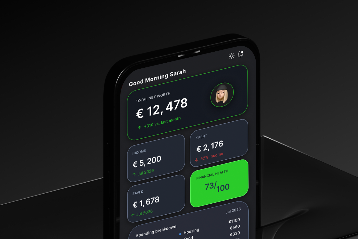
Munly — A Personal Budget Advisor for Modern Money Habits
Overview
Munly is a mobile-first budgeting and financial wellness application designed to help people build healthier, more sustainable relationships with money. The concept behind Munly goes beyond traditional expense tracking by focusing on behavior, mindset, and emotional interaction with finances. The app is positioned as a daily companion that helps users understand their habits, improve their decision-making, and gradually develop stronger financial discipline over time. Instead of overwhelming users with data or limiting them with rigid rules, Munly aims to create a balanced experience that feels supportive, intuitive, and motivating.
Problem Space
Managing personal finances is often assumed to be a rational process, but in reality, it is heavily influenced by emotions, habits, and external pressures. Many people struggle not because they lack access to financial tools, but because those tools fail to align with how people actually think and behave. Younger users often feel overwhelmed or anxious about money and avoid budgeting altogether, while older users may rely on outdated or overly rigid systems that do not adapt to modern financial realities.
Existing budgeting apps tend to focus either on complex financial data or overly simplified tracking systems. As a result, users either feel intimidated and abandon the app or fail to gain meaningful insights that lead to real change. This creates an opportunity for a product that bridges the gap between usability and behavioral guidance.
Research: Generational Money Behavior
Understanding how different generations approach money reveals significant differences in spending habits, saving behavior, and financial mindset. These differences play a critical role in shaping how a budgeting product should be designed.
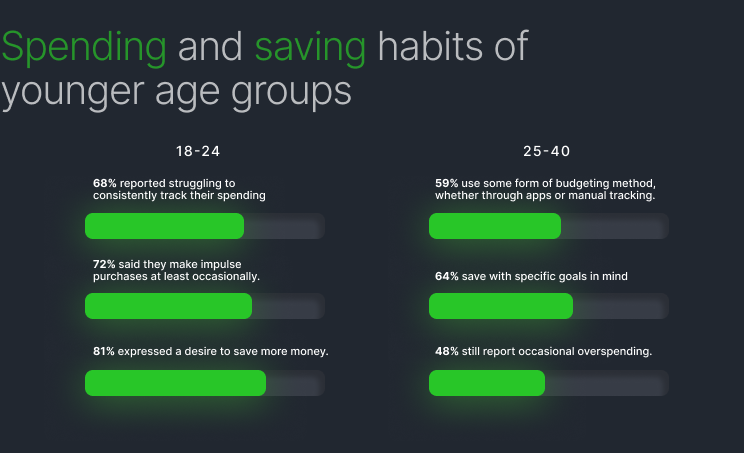
Younger users, particularly those in Gen Z, tend to have a more fluid and experience-driven relationship with money. Spending is often influenced by social environments, digital culture, and the desire for immediate gratification. While many express a strong intention to save, their habits are inconsistent due to fluctuating income, rising living costs, and a lack of structured financial education. Financial anxiety is common, and budgeting is often perceived as restrictive rather than empowering.
Millennials demonstrate a more structured awareness of finances but often feel caught between short-term expenses and long-term goals. Many are actively trying to manage debt, rent, and savings simultaneously. While they are more likely to adopt budgeting tools, they frequently abandon them due to complexity or lack of visible progress. Their main challenge is maintaining motivation and consistency over time.
Older users, particularly those in Gen X, tend to have more stable and disciplined financial habits. Their spending is generally more necessity-driven, and saving is a higher priority, especially for long-term security such as retirement. However, they may be less inclined to adopt new digital tools unless the value is immediately clear and the interface is simple and reliable.
Across all groups, a common pattern emerges. Younger users struggle with consistency and emotional spending, while older users struggle with adaptability and engagement. Most financial tools fail because they either overload users with information or fail to guide behavior in a meaningful way.
Target Audience
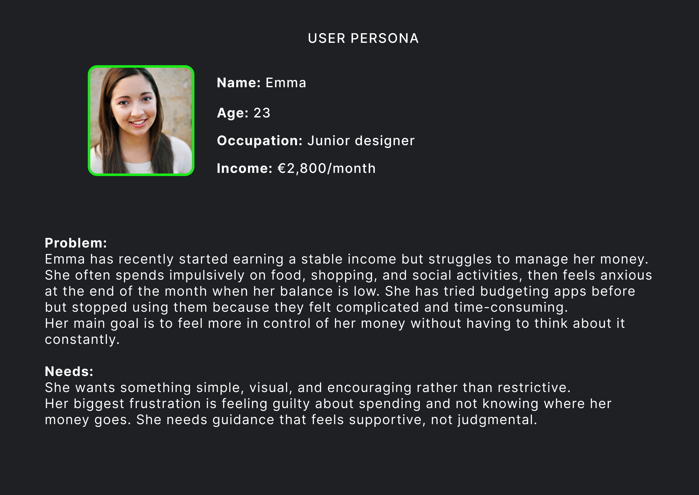
Munly is primarily designed for young adults between the ages of 20 and 35 who are beginning to manage their own income but have not yet developed strong financial habits. This group is digitally fluent and comfortable using mobile applications, but often lacks tools that feel approachable and supportive rather than intimidating. They are motivated to improve their financial situation but need guidance that fits naturally into their daily lives.
Design Direction and Visual Identity
The visual identity of Munly is built around clarity, comfort, and approachability. Financial management is often associated with stress, so the design intentionally avoids harsh or overly corporate aesthetics. Instead, it uses soft colors, rounded elements, and clean layouts to create a sense of ease and trust.
The primary color palette includes soft mint green to represent growth and balance, combined with warm neutral tones to create a calm and welcoming background. Subtle accent colors such as coral or lavender are used sparingly to highlight key actions and insights. Typography is simple and modern, with an emphasis on readability and spacing to reduce cognitive load. The overall design aims to make financial interaction feel less intimidating and more like a natural part of daily life.
Dark Mode vs Light Mode
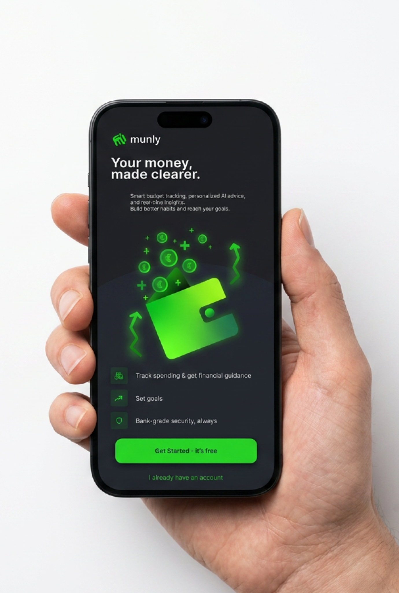
User preferences for visual themes vary significantly across age groups. Younger users tend to prefer dark mode because it feels modern, reduces eye strain in low-light environments, and aligns with the design language of many apps they already use. Dark mode also creates a more immersive and personal experience, which is particularly important when dealing with sensitive topics like finances.
Older users generally prefer light mode because it offers higher readability and feels more familiar. Munly accommodates both preferences by offering a fully optimized experience in both modes. However, the primary design emphasis is placed on dark mode to better serve the core target audience while maintaining accessibility through a clean and well-structured light mode alternative.
Current Problems with Budgeting Apps
Many existing budgeting applications struggle to retain users because they fail to address real behavioral challenges. Some apps require excessive manual input, forcing users to categorize every transaction and maintain constant engagement, which quickly becomes tedious. Others present financial data in a passive way, offering little more than charts and summaries without actionable insights.
A common issue is the negative emotional tone. Users are often confronted with messages that highlight overspending or poor financial decisions without providing constructive guidance. This creates feelings of guilt and discouragement, leading users to abandon the app altogether. Additionally, many apps lack personalization, treating all users the same regardless of their habits, goals, or financial situations.
Munly’s Solution
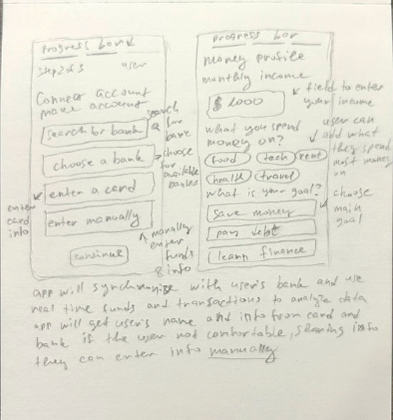
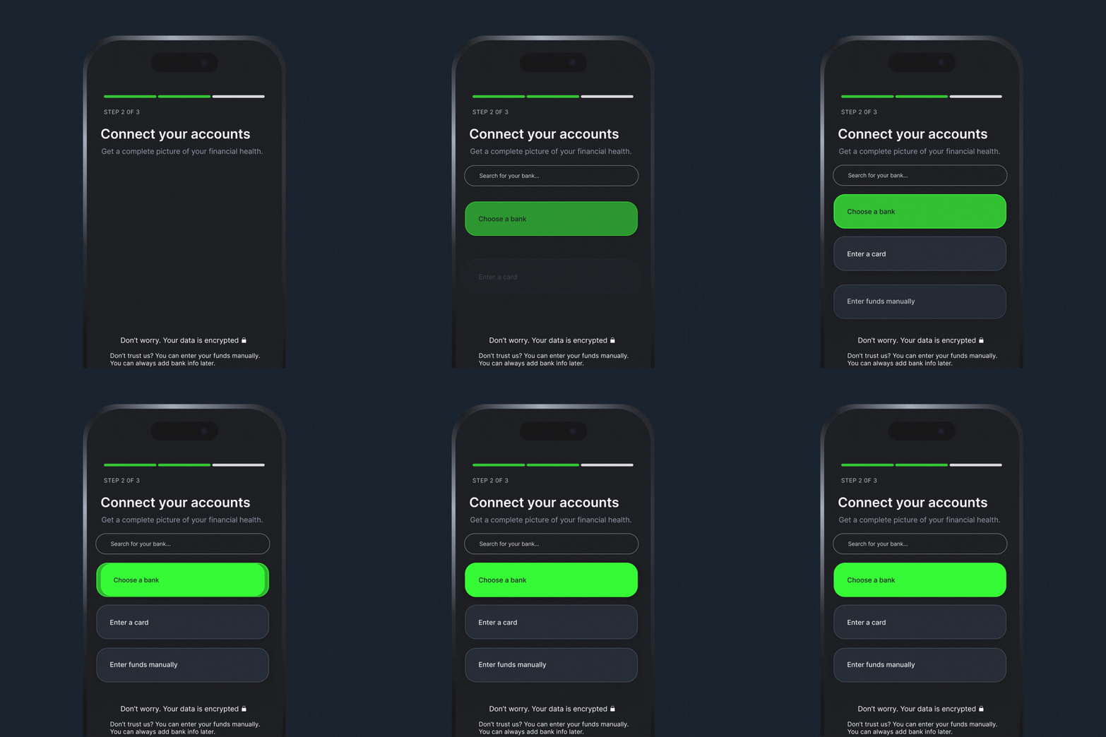
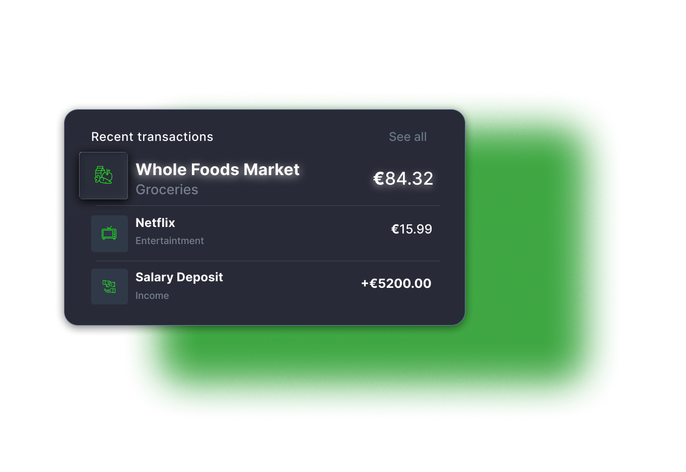
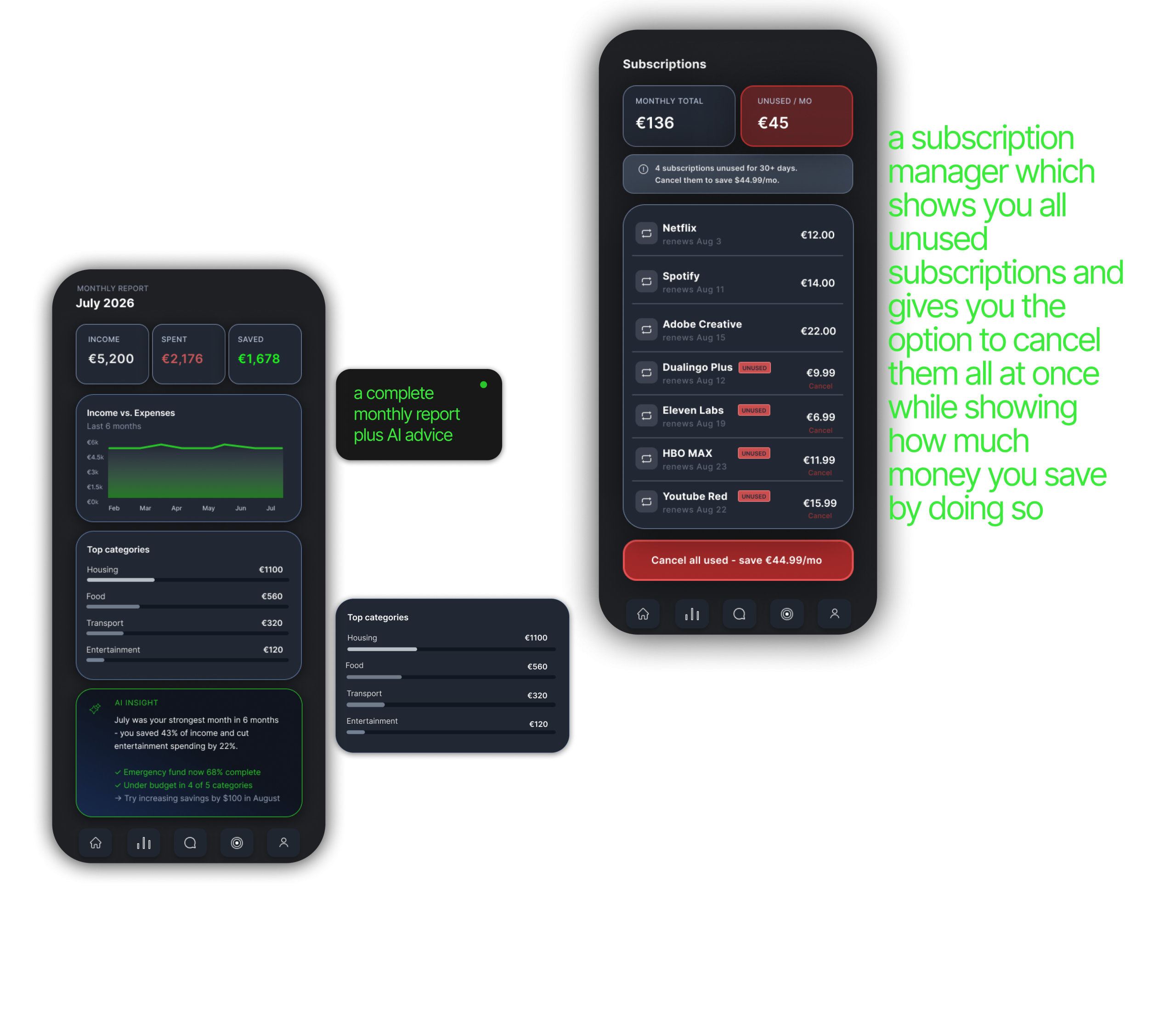
Munly addresses these challenges by focusing on behavior rather than just data. The app simplifies expense tracking through automation and presents information in a clear, visually digestible format. Instead of overwhelming users with numbers, it highlights patterns and trends that are easy to understand.
The key innovation lies in how the app communicates with users. Rather than using negative or judgmental language, Munly provides supportive and actionable feedback. For example, instead of emphasizing that a user has exceeded their budget, it suggests small adjustments that can help them stay on track. This shift in tone encourages users to engage with the app consistently without feeling discouraged.
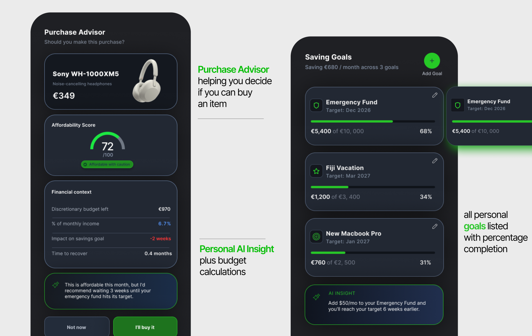
The app also adapts to individual behavior over time, offering personalized insights that become more relevant as the user continues to use it. This creates a sense of progression and makes the experience feel tailored rather than generic.
Improving Saving Habits
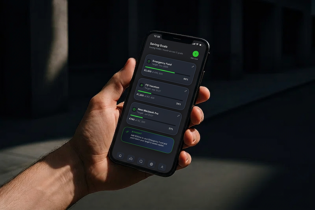
Munly helps users improve their saving habits by focusing on small, consistent changes rather than drastic restrictions. Many people underestimate the impact of minor daily expenses, but even small adjustments can lead to significant savings over time. For example, reducing unnecessary spending by just five dollars per day can result in approximately eighteen hundred dollars saved over the course of a year.
Impact on Financial Mindset
One of the most important outcomes of Munly is its impact on how users think and feel about money. Financial stress often leads to avoidance, which in turn worsens financial situations. Munly breaks this cycle by making financial management feel approachable and rewarding.
The app encourages awareness without judgment, control without rigidity, and progress without pressure. Over time, users develop a stronger sense of confidence and clarity, which leads to more consistent and intentional financial behavior. This shift in mindset is what ultimately drives long-term success.
Outcome
Munly positions itself as more than just a budgeting tool. It becomes a daily companion that supports users in making better financial decisions and building sustainable habits. By combining behavioral insights, thoughtful design, and an understanding of generational differences, the app addresses the root causes of financial struggles rather than just the symptoms.
Final Reflection
Designing Munly highlights the importance of human-centered thinking in financial products. Money management is not simply about numbers, but about emotions, habits, and long-term behavior. A successful product in this space must balance functionality with empathy, providing users with both the tools and the motivation to improve.
Munly demonstrates how design can influence not only what users do, but how they think. By creating a system that feels supportive and intuitive, the app has the potential to become a meaningful part of users’ daily lives and a catalyst for lasting financial change.